Latest Entries »

Working with architecture and in interior design, there are opportunities that arise which alter your perspective on design.

Mercanteinfiera is one of the opportunities.

goo.gl/V9R86R

Through the Antiques Diva, I was introduced to the fair held twice each year in Parma, Italy where over a 1,000 vendors assemble in a convention center with a multitude of items – furniture, art, accessories – come together.

What is unique about this opportunity is that they are opening the fair to Design Professionals and VIPs for two days before opening to the public. What a gift! Antique shopping comes down to first come and first served and to arrive before the masses – an amazing gift.

I contacted my current and past clients as well as colleagues and friends to begin a shopping list.

This fair offers a unique experience to virtually shop with me – as I will be issuing emails with images of what treasures are found.

Should you like to be on the list – please email me and we can discuss the items you have been looking for.

justin@justinshaulis.com

Furniture, Accessory and Lighting Fairs can not only be a great opportunity to be introduced to new product, but to also be inspired by the creative efforts of the vendors to display their wares. Granted, in years’ past, much of what was shown was just a reiteration of years previous. 2013 is an exception to say the very least.

The vendors showed great effort in not only understand the revised direction of design – meaning lower budgets with even less patient clients (shortened lead times) – but a return to materials that are not only luxe but also cost conscious.

But how do you walk a fair – to take it all in?

You could spend days checking out each booth. Often, the way in which you experience it is like that of being led from one exciting thing to the next.

Give yourself the opportunity to stroll through and get invigorated.

Then take a more detailed approach.

Make sure to get the literature, take away’s and get your badge scanned.

Realizing this advice is late – it is still a wonderful approach for future shows.

All the best to you in design!

Seems more and more the idea of “Concept Image” is piloting the design process. But is this useful in terms of catering a high level of service to clients?

More to the point, does the client wish to live in a magazine spread or an ad for the latest sofa?

My professional take on design happens to be that of developing a unique response to the client: their life-style, their life-habits, their life-pursuits and suitable for the life-time now and in the future.

So, developing an aesthetic or a design response becomes the primary goal. Where can you begin with the composition? Get yourself a furniture plan first – so at least you have an idea of what and how many and as well describe the circulation through the space.

Shopping. Often times that can be the starting point – falling in love with a piece – foundation or accessory – that may be the starting point for the whole room.

I am currently composing a family home. The family is dynamic. Traveled. Cultured. But they also don’t take themselves too seriously. A sense of humor is always important with an interior.

I am originally from Pennsylvania and the aniquing and thrifting is amazing. Most don’t understand exactly what they have so the price point is reasonable. But as well, the pieces themselves tend to be unique and not the habitual of what you see in many of the nesting magazines.

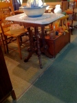
What caught my eye in my most recent trip were several Eastlake-styled occassional tables. Beautifully crafted with lovely patina-ed stone tops in softly honed carrara marble. I started thinking about how these might spawn an entire room – not a period one – but one that feels cozy, comfortable and with a storied past with each one holding treasured family heirlooms and accessories to pull the finishes together: Crystal, Silver, Ceramic and books.

A grandfather clock can be a great addition as it provides the auditory component in a room. The ticking and chiming assists in making it feel more like a home. I came an art deco inspired clock with a great burl framing the glass.

Layering next… This Great Room will be composed of multiple seating groups (which is also why unique occasional tables are so important as there will be so many of them) and the seating within the groups need to be varied in size, texture and finish. Upholstered pieces need to have foundation pieces – those that anchor the room – and pieces that can be moved around to pull up for a more intimate grouping as well as not crows the focal points.

More to come on this Room!


Space Planning

Part of being in Interior Design is the joy of finished room – not just upholstered pieces, but cabinetry, tables, bookcases, art, accessories… but the way all of these items come together and create an expression, a feeling, a moment – a place for memories, for a family to grow in (and sometimes out of) – to gather and entertain…

When starting a brand new project, you have the freedom to try something new, something different. But when you inherit a project or have to work with existing pieces, it can get very challenging.

In New York City, we struggle with those clients with townhouses or brownstones. It is a rarity you find them wide enough for two spacious rooms. Usually the width is enough for a room and a hallway. This is typically as many of the facades on the street are three windows wide.

I am just staring a project in a great section of Brooklyn called Boerum Hill. The clients I have worked with in the past and they have brought me back to figure out their next steps with their townhouse.

The Foyer, Kitchen, Dining and Living Area is all on the Parlor Level which means high ceilings and great amounts of light. The street is tree-lined and very picturesque when viewed from the kitchen which is in the front.

What they are struggling with and why they have brought me back is that for this home – they hired a different architect but no designer. They have come to realize that they can’t do the interior design themselves and the lack of storage and planning for livability of this active family can’t continue.

We are faced with the built-in questions: Cabinetry. Dining. (Questions of round table, square table, rectangular? Should the seating be a banquette a bench or chairs?)

At the heart of it all is the lifestyle they want to have and the moments they want the space to envelope.

The trend in the last few decades have been homes with very large Great Rooms or Living Rooms or Family Rooms or just a place for the entire family – and the extended one – to hang out and enjoy each other’s company, watch a game, the Academy Awards or have a holiday moment.

These rooms are often overscaled with large windows, a higher ceiling and perhaps even sunken. The architectural elements are oversized and usually repetitive.

Usually, the square footage is there for everything to fit, but sometimes the shape is off – meaning long and narrow with windows and doors on each wall or a square with windows and doors and all walls. You can see what I am getting at – wall space is precious – not sure for the TV, but for Furniture, Art, Photography, etc.,…

As a designer, these are the spaces that are the most captivating- and challenging. It will be where the family spends the most time and it also needs to have enough seating – some of it flexible – to hold large gatherings but still be intimate for the immediate family. The challenge is developing a unique furniture plan where the pieces that compose the room, the order, color and texture and all complimentary.

I believe it comes down to the style of the room as to which direction of the quantity of pieces. If it is a more modern space, having a few large overscaled pieces can be very useful as it maintains the minimal nature of the aesthetic and you get a big bang with dramatic gestures – such as a large sectional, ottoman and chair-and-a-half.

If the space is more transitional – somewhere between modern and traditional – the pieces  are of a normal scale and multiples of the pieces are the way to go – maybe two sofas, matching chairs and varying small tables and other occassional pieces.

But what about the arrangement? How should they be organized?

I like to first identify the focal points: View to the Outside, Fireplace, Television, etc.,… The more focal points, the bigger the challenge. If you have a chance to marry the focal points like putting the TV above the Fireplace, that might work – but bear in mind it can be sometimes confusing to group strong elements together. Once you have your focal points you now know where you want to be sitting in the room to take advantage of the focal points.

At this stage, there is the aesthetic and focal points that you know. The next should be the target of how many seats should be in the space – and will those seats be lounging or more sit-up-and-take-note kind of seating. Maybe even the furniture facing the TV is more lounge-like and the Fireplace more of the sit-up type…

In any event, a good rule of thumb is 15″-18″ between the front of a sofa or chair and a coffee table. Usually 18″-24″ between pieces of furniture is enough to navigate through a room. It is important to track an implied hallway through the room to get to those patio doors that are usually at the other end of the space. As well, if the family has small children, these rules need to be modified as an area for play needs to be determined.


Vintage Finds

When you are in the design business, it seems that friends enjoy asking your for your professional opinion about finds at flea markets and vintage stores.
Sometimes, these questions invariably are irritating. But there are a few, that strike your fantasy for those goldmines that are hidden and under-appreciated.
It isn’t the seller’s responsibility to know the exact pedigree of pieces they are selling. At the end of it all, it must be the buyer’s love of the piece.
Why?
Value isn’t guaranteed. After all, a piece will usually fetch more in an urban area than a suburban one.
Take for instance a friend locating two Asian inspired slipper chairs. They have a brass frame – very heavy – the lacquer looks in good condition and the upholstery appears to be original and as well art deco inspired.
She loved them because they were different.
She paid $40 for the pair which she thought wasn’t cheap.
I saw and wondered immediately where she got them.
Vintage she said.
It is at these times you go green with envy – just there in the eyes.
I had to do some research and stumbled across them on 1st dibs which then directed me to a high-end antique store in New York City.
http://www.1stdibs.com/furniture_item_detail.php?id=429231
I inquired for the price and even I was shocked.
$8500 for the pair.
What? That much?
Well, good for her.
What are her next steps? She just wants to enjoy them.

Project Management

As with any business venture, you need to understand the steps in order to grasp the total time required to complete. Also, good thing to prepare for the inevitable challenge or conflict resolution that arises especially in Design.

How many Designers break down the process into phases to better understand not only how much time should be invested, but was? How many projects end up suffering for too much time in the design phase and not enough left to implementation – meaning to resolve the challenges or conflicts that arise?

I was trained as an architect and as such, design in the architectural profession is broken down into the following… I have attached percentages for each phase based on my experience.

Schematic Design: 15%
Design Development: 20%
Construction Documentation: 25%
Construction Administration: 40%

It is a challenge to project percentage of time invested on a project. It is also tough to stick with those numbers.

However, the safeguard of time is there to deal with the problems when they come up.

For the person looking to hire a designer, consider the process as well. The more educated you are as to the process, the easier it will be to negotiate your designer’s contract and understand their fee structure.

The design process is rarely fluid.

Whether it has time or budget constrictions, something always gets in the way of it moving quickly and easily. For many clients, this stop and start is seen as a frustrating if not irritating situation. While for the designer, it can be a presentation of great opportunities but can also mean unanticipated extra work.

This blog entry is about how Building Codes can be the wild card.

We are working on a home at the Shore presently. It has been a delight to work through the ideas of “lifestyle” with the clients. They are a young couple who are well-traveled with young children and wanted the house to be relaxed, informal but also able to polished up at a moment’s notice should someone stop by. They would prefer it to be stylish, yet classic so that it wouldn’t be dated “so 2010.” They also want the materials to be hard-wearing and long-lasting and be kid-friendly yet sophisticated enough to entertain friends, family and colleagues.

Big Wish List, right?

Not really.

The clients found the house by accident while boating and felt an immediate attraction to the arts and craft bungalow with low slung roofs barely visible through cedars up a gently sloping garden from the water. It was on the market and the price was reasonable enough for them to enjoy for a few summers before taking the plunge into a full-scale reno.

The house’s eccentricities were not at first completely understood. The low-slung roofs cause you to stoop when inside trying to take in the spectacular view for one. The arts and crafts styling proved to be too original in its state for an active family for the next point. And finally, the site is long and narrow with the narrow edge along the water. Funnily enough, the site is actually too narrow to have a considerable sideyard (one wide enough to walk through). In this situation, you have to use the street to get to the backyard. This condition is a common occurrence in dense urban areas, but rarely in areas considered, “suburban.”

But even with these eccentricities, the house is wonderfully sandwiched between that sloping rear garden to the water and a large (but narrow) wooded section completely underutilized.

We started wanting to maintain the feeling of the original house.

Emotive Design.

At the end of the renovation, the house should feel as if it has always been that way. Keeping the meandering paths in the gardens, the exposed eaves, the scale of the house and outbuildings was penultimate.

Often when seeking approvals from local communities, the design must change or evolve to address the building code. Our initial design included three buildings: the house, workroom/studio and detached garage. The three structures would create a community of hipped-roofed buildings connected with gardens, pergolas, paths and breezeways.

Today, working through the design in consideration of the building codes, we came to a point where we had to backtrack to what our purpose was: To design an intimate home with associated garage and workshop keeping in mind it is a shorehouse and must adapt easily to sand, salt air and constant use.

The building code was encouraging us to connect the house with the garage and merge the workroom/studio with it.

Our initial response was disappointment as we wanted to maintain the campus-like feeling of the three structures. But as we are working to gain approvals, we found ourselves having to adjust our thought process.

We are grateful for the shift as the design is now nearly complete.

We have designed for the intimacy, the old-world feeling, but still have satisfied the local building code.

So, even though the house isn’t exactly what we sketched and fleshed out at the start, we still have the intimacy, the old world styling and the cohesive nature of that original eccentricity that initially drew the clients to the house in the first place.

Next Step for the Shorehouse? Budget! I will start tackling that this week.

Photo Shoot

Yesterday, the Chelsea Loft was shot for Apartment Therapy’s House Tours. Apartment Therapy
The weather couldn’t have been more perfect.
We had shot the apartment previously and shopped it to several magazines, but sadly, nothing ever came of it. I am eager for the Loft to be seen by more than friends, family and prospective clients as the space is the result of a great collaborative effort between the myself and the clients. We were dedicated to designing something special. We wanted the space to be unexpected – classically modern with a delicate feeling both soothing and warm.
Granted, we already had a space with great bone structure – how many lofts do you walk into a half-level higher than the main space?
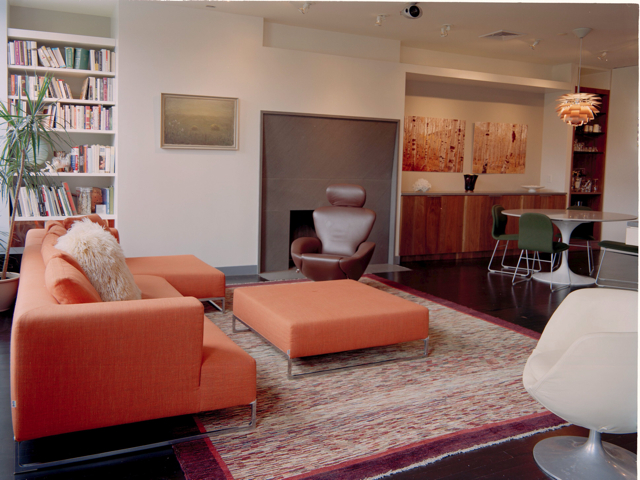
To take advantage of the openness, we didn’t want to crowd it with multiple seating groups. The next step was elongating the sofa, the armchair, the tables so that each was in proportion to the space and to each other.
The result was a 16′ long sofa with a chaise the size of a queen bed and a 4′ wide armchair long and deep enough to pull up your legs and curl in.
The space could easily have been a white Chelsea gallery box with sleek walls to show off the art and the furniture, but this is a home for a young vibrant family. The colors needed to support their varied interests and activities. The textures also needed to be enough to warm the space to the eye and to the touch. Tonally, we set off on the concept being soft tones the color of rich earth and cool sky with accents of pewter and autumn leaves.
A home is composed of rooms with purpose – the organization of the spaces in the Loft were visually composed with a thread clearly running through. Color, flow, material all in sync connecting the spaces.
So, the Dining Room supports the Great Room with a long glass top supported on two thick white marble plinths. The head chairs are high-backed while the side chairs are low-backed with the tops hovering just above the glass. The Kitchen is rendered in warm cherry cabinetry and gray stone counters which echo the gray stone tile floor connecting it with the Kitchen. The Media Room beyond is where the warmth really comes through. Initially, the space was to be a wide hall with laundry, home office and the three bedrooms fed just off of it. However, an inset wool sisal, curving sofa and round game table gives purpose to the space. The warm cherry paneling – same as the kitchen’s cabinetry – give breadth and height to the space while the landscape photography provides a view that balances the TV without competing.
The three bedrooms are unique – two rooms for the girls and the Master Bedroom. One girls’ room is a tiffany blue with crisp white accents. The other girl’s room is a dreamscape based on a Grimm’s Fairytale.
The Master Bedroom is an oasis in tones of Moonshine, Fern Green and Soft Gray. Polished nickel accents the space giving it a glimmer. The grass cloth is foil-backed, reflective but also counterbalanced by the natural material and texture. The grass cloth covers the headboard wall and the ceiling. The furniture is appropriately sized and the mixture is both modern and classic showcasing oak, sycamore and walnut.
All three bedrooms lead out onto a deck spanning the width of the Loft.
The project was an exciting one with dedicated clients with a common goal. I am very proud of the work,
The loft will be shown as one of the house tours for Apartment Therapy. Let me know your thoughts!

Phases of a Project

Today we finished the Master Bedroom in the Loft by installing a few choice features to add the lifestyle component it had been missing. First is a foil-backed grass cloth that perfectly compliments Benjamin Moore’s Moonshine. The grass cloth was installed on the headboard wall and the ceiling for added warmth in the room. Enhancing the complex nature of the texture are polished nickel sconces. As husband and wife have different sleeping patterns, two LED pipe reading lights were installed for discreet lighting.
The dresser and armoire swapped locations in order for a flatscreen display to be installed. Flanking it are two more of the polished nickel sconces.
The bed linens were changed to add more color and texture with a figure-ground goldenrod embroidery. The colors are crisp white with varying shades of wasabi and chartreuse. The new linens also helps the gunmetal-colored microsuede of the upholstered bed to really stand out against the grass cloth.
The nightstands were dressed with Shagreen-embossed ivory-colored trays with polished nickel handles that hold books, flowers, phones, remote control and the nightly glass of water.
We opted to maintain the solar shades on the windows for a clean minimalist look.
The photos were shot with a digital camera, but this weekend, the entire loft is being shot professionally and more of the refreshing will be apparent. I will let you know when it gets published for the House Tour for Apartment Therapy.